Do you spot something unique in this logo?
Look closer. The ‘L’ appears to lift the ‘A’ bringing this forklift truck manufacturing company’s offering to life. This is an apt example of how typography can transform brand identity through textual design.
Many creative experts have successfully attempted to create a logo that expresses the brand presence by inculcating typographical design elements. They have managed to turn them into appealing visuals with subliminal messages that take the audience by surprise.
Here’s a look at a few typographic logos that you may want to look at twice!
![]()
The Baskin Robbins logo was conceptualized by Ogilvy & Mather — at the time, the agency was known as Carson Roberts. As straight forward as it may seem, this simple logo highlights the number ‘31’ alluding to the number of flavors offered by the brand. Cryptic isn’t it?
![]()
Designed in 1994 by Linden Leader & Landor Associates, this logo may appear simple and straightforward. However, in the white space between the ‘E’ and the ‘x’, you can see a right-facing arrow. This ‘hidden’ arrow was intended to be a subliminal symbol for FedEx’s speed and precision.
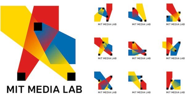
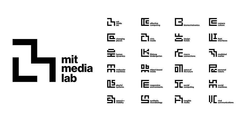
This one-of-a-kind logo was designed by Micheal Beirut for MIT (Massachusetts Institute of Technology) — one of the world’s most renowned research and development centers. Using the same 49-square grid dimension of the old logo, Beirut designed a new visual identity by imprinting the initial letters of each department within the grid in an abstract form.
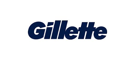
At first glance, you may argue that it’s just the name of the brand. What’s so special about it?
*drum roll*
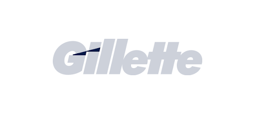
See the diagonal slices of whitespace passing through the letters ‘i’ and ‘G’? It represents the sharp, quality razor blades that Gillette is famous for. Who would have thought that the smart use of space could highlight Gillette’s brand message with such sharpness (pun intended)?

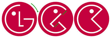
The LG logo was designed to represent the warmth and youthful atmosphere of the brand by making use of the letters ‘L’ and ‘G’ in a circle denoting a smiling face.
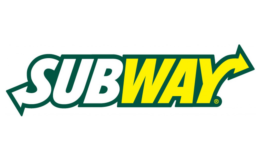
This famous logo is as tasteful as its subs. The arrow pointing left in the ‘S’ and the arrow point right in the ‘Y’ of the logo symbolize the entrance and exit of a subway station, embodies the American culture of having food on the go.
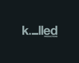
Designed by Sean Heisler for Killed Productions, this logo depicts a fallen ‘i’ refers to the word ‘Killed’ in its name. This is a smart way of turning a letter into a character.
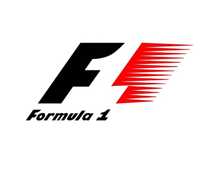
The F1 Logo, designed in the early 2000s, is commonly mistaken to be the abbreviation of formula 1’. Look again. See the white space between ‘F’ and the element in red? Yes! That’s the number ‘1’ you’re looking at!
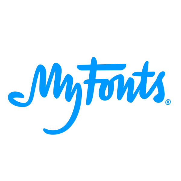
MyFonts is the place for those who love creating magic with unique and quirky fonts. Created by Underwear in the Netherlands, the word ‘My’ is designed to look like a hand denoting an individual’s power to choose any font they prefer.
These examples are proof that a typographical logo has the power to influence a customer’s perception. We all enjoy an attractive and vibrant illustrative logo but let’s face it, those ‘Aha! I see it!’ moments make us appreciate the brand and the designer’s imagination a little more.