Here’s the thing about hoardings — they’re gigantic, yet easy to miss. The average attention span of a human is 8 seconds, which is, in fact, very small a duration to notice hoardings in moving traffic. This makes it all the more necessary for them to flaunt neck-turning content; precisely why putting all your information up point blank will do your business no good. Utilizing this space cleverly, on the other hand, can work wonders for a) your product/service itself, and b) your brand identity.
To inspire your advertising decisions, we’ve curated 10 billboards that managed to really rise above the crowd.
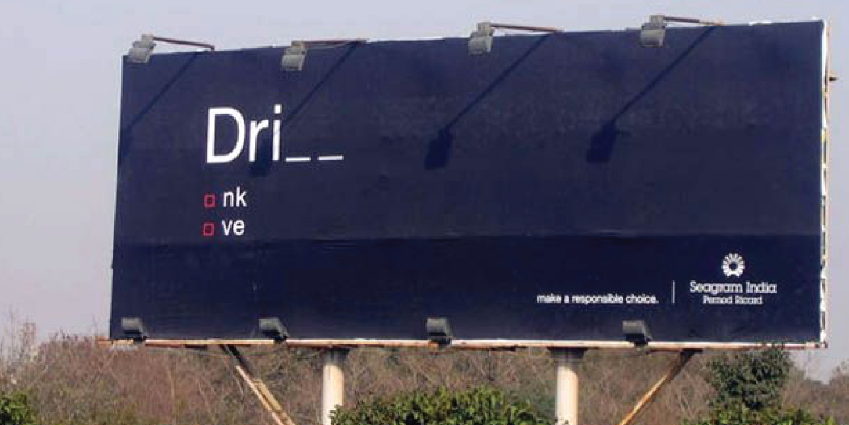
1) As minimalistic as it gets, this hoarding features simple, smart, and powerful copy. No elaborate visuals or jarring fonts — just a clear message on a clean layout.

2) This Pond’s ad with a refreshingly new concept is testament to the fact that billboards aren’t just giant canvases, but spreads of endless possibilities. By using one end of the hoarding itself as an integral part of the design, this one makes for a simple yet effective ad.
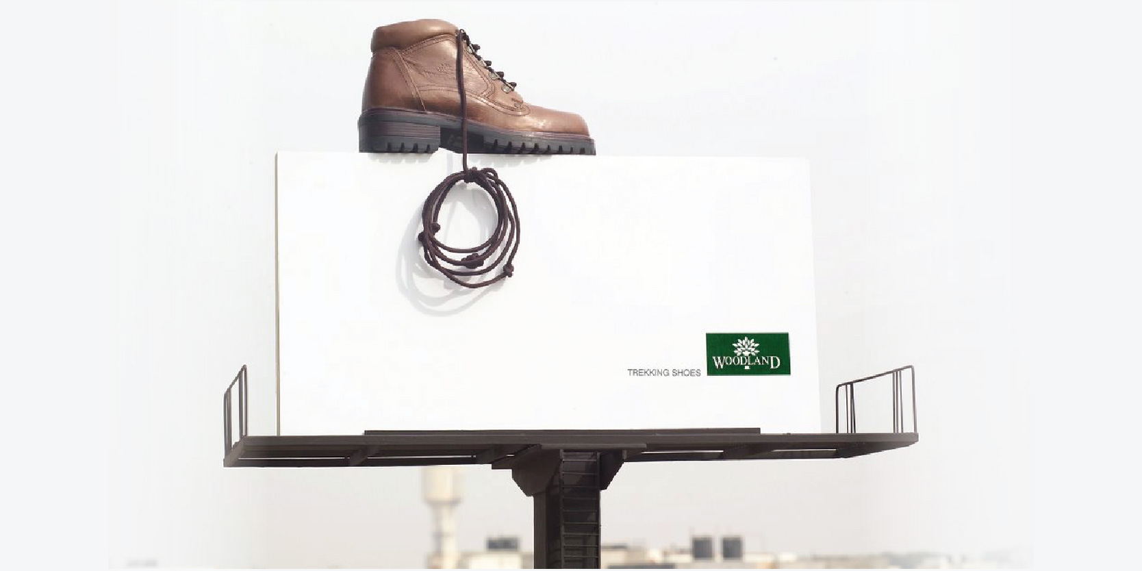
3) Doing full justice to Woodland’s adventurous brand persona, this larger-than-life shoe with a shoelace doubling as a climbing rope is nothing short of genius. Having ads that are consistently relevant to your brand image will ensure it achieves the desired identity.

4) Coca Cola’s infamous drinkable ads are usually the talk of the town, much like this humongous Coke Zero hoarding. It leads to actual dispensers — making for a delightful, interactive billboard.

5) Self-explanatory, simplistic, and clever beyond measure — this one uses the hoarding in its entirety, going beyond the boundaries of rectangular space to promote the service and its exact offerings. No wonder, out-of-the-box concepts work the best at making your brand stand out amid competition.

6) This nature-interactive billboard for a range of all-natural hair colors is so smart that it leaves us in awe. The hoarding makes full use of the background it’s set against to give the passers-by a visual delight.
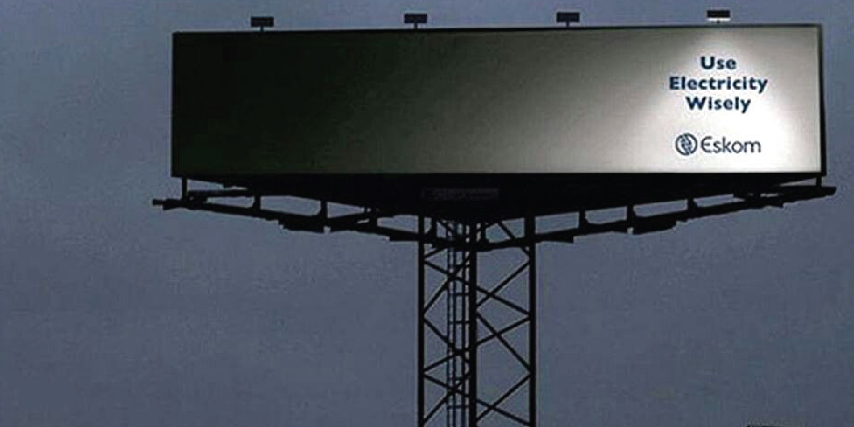
7) Smart and self-explanatory, this extremely well thought-out hoarding is a perfect example of how you can make your ad live up to its message.
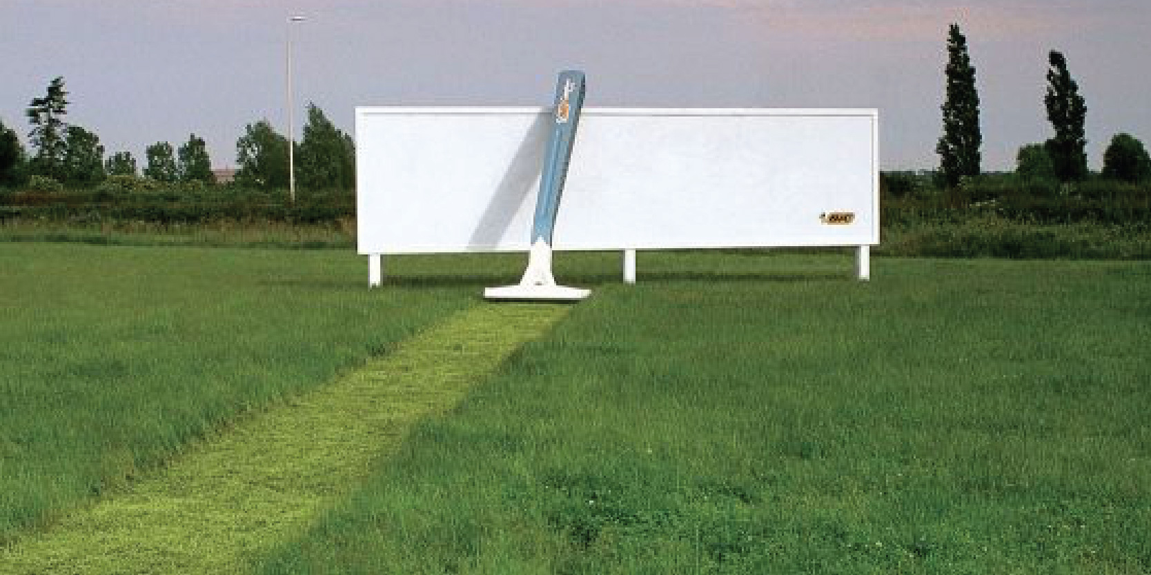
8) Here’s a clever razor ad utilizing its surrounding landscape in the best possible way. This no-nonsense design with nothing but the product and the logo ensures clear visibility and superior brand recall.

9) This has to be to be among the most creative milk ads ever made. By using a smartly placed hoarding, the design effortlessly puts across the brand message of making kids stronger.
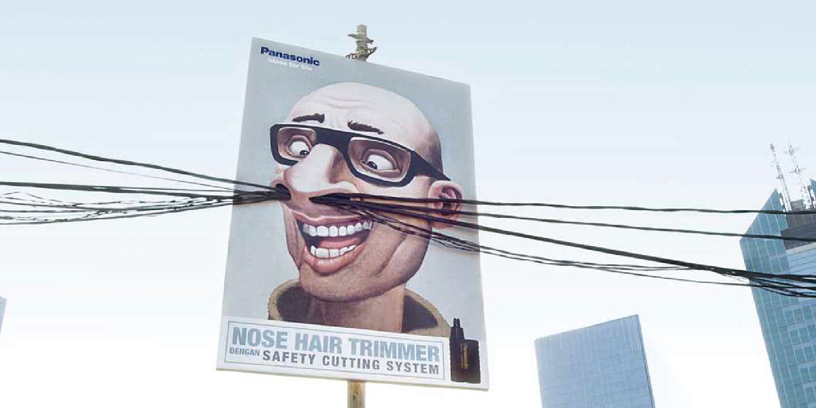
10) Panasonic’s trimmer hoarding uses this delightfully exaggerated, yet effective concept where telephone wires represent nose hair. A serious head-turner, this one!
These hoardings make for great examples of unique advertising, giving you a complete view of the landscape that is creative advertising. This is where an ad agency can go a long, long way in supporting your identity endeavors. So, put your money where it matters, sit back, and watch your business grow!
