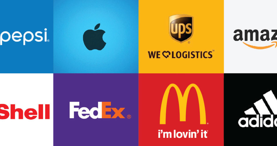
Logos might be small in size, but the right mnemonic can make a huge impact in shaping your brand. Thanks to its widespread usage ﹘ from websites and letterheads to billboards and giveaways ﹘ it occupies a majority of your brand’s visible real estate.
Designing a logo might seem simple, but it has the power to make or mar your brand image. Since design itself is an extremely subjective topic, understanding and analyzing the logos of some famous brands looks like the right place to start when working on your own. After all, as Mark Twain once said, “Past behavior is the best predictor for future performance”.
 Pepsi – Changing with the times
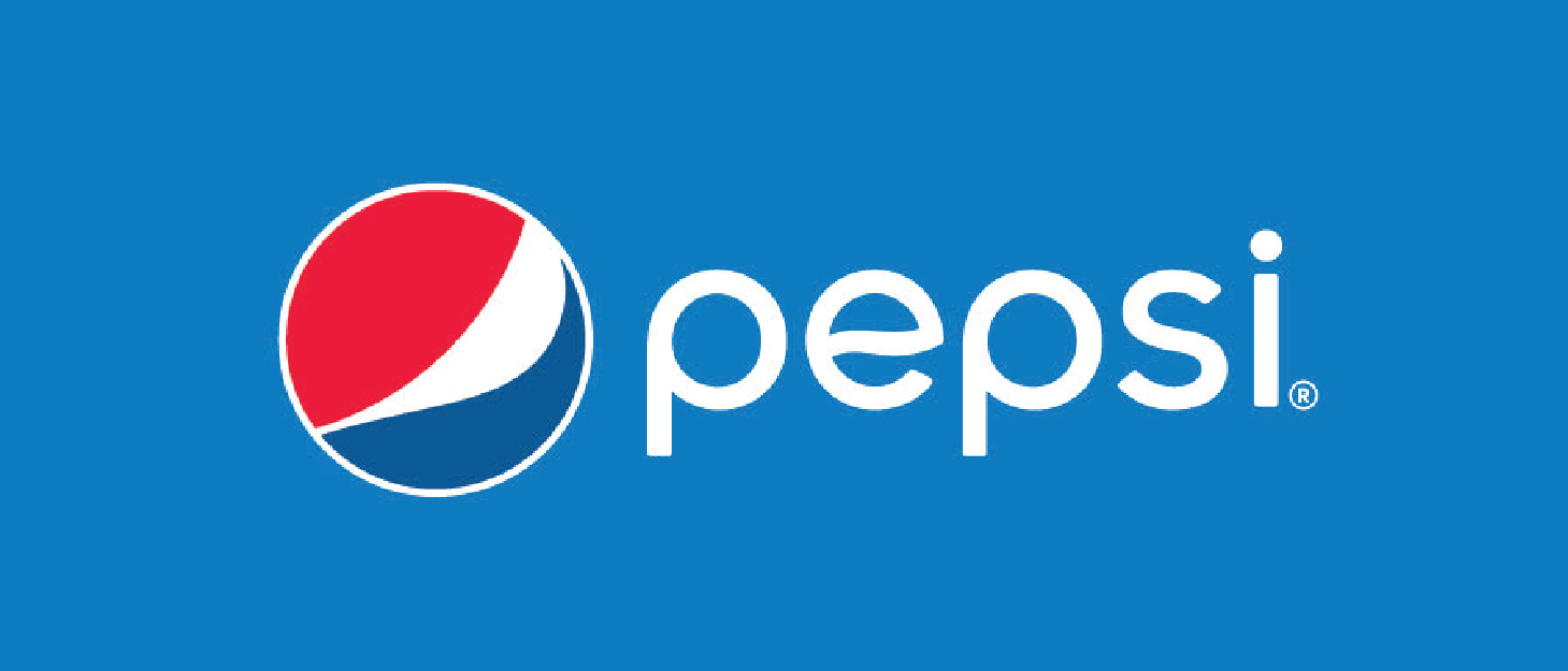
The Pepsi logo is familiar to households across the globe. While the red, white, and blue colors of the brand can be seen on every billboard today, the logo itself has undergone multiple changes since its inception in 1898.
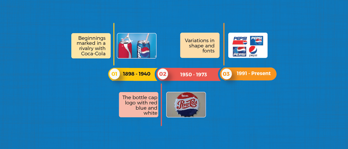
Pepsi used a range of different variations, shapes, and fonts over the decades that followed. Each of these reflect the trends popular at the time. The current logo however, uses a new imagery and different approach. The logo gives a subtle impression of a smile, while retaining the well-established brand colors and typography. To sum it up, Pepsi has been able to capture its consumer base by constantly evolving with time, making the most of current trends and consumer sentiments ﹘ all in an effort to demonstrate itself as a ‘refreshing’ brand.
 Apple – Defining design trends
The half-bitten apple of Apple Inc. is among the world’s most recognizable logos. Some might even say that it’s the perfect representation for the brand. But it wasn’t always the same.
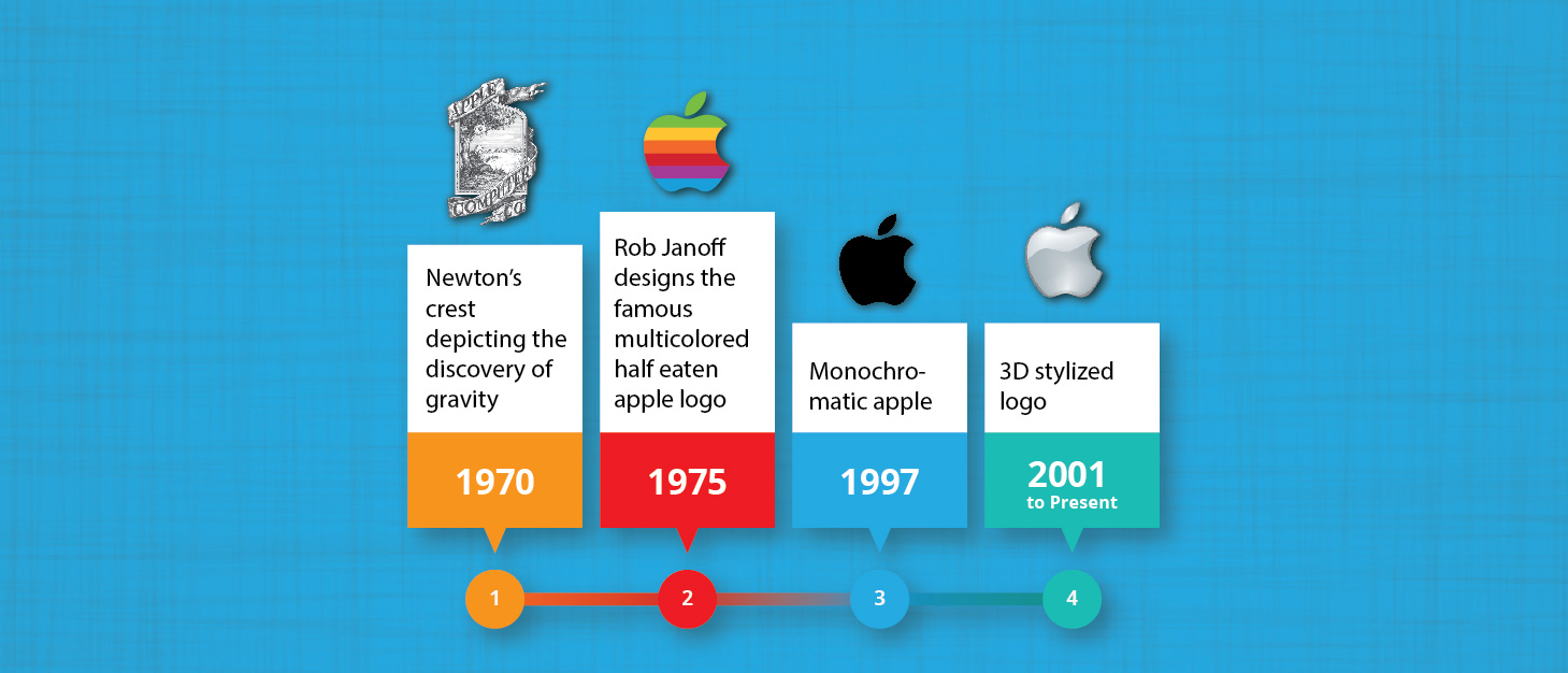
What needs to be noted here is how Apple, barring the initial crest, has successfully captured the styles and sentiments of the time and was able to spark trends of its own. The design approach perfectly symbolizes Apple’s brand image of being at the forefront of technology with a minimalistic, yet cutting-edge logo design.
 UPS – Simplicity stands out
A UPS package-delivery truck, zipping across the street, is one of the most common scenes across the globe. One of the factors that made this brand is its logo ﹘ a perfect example of ‘adapt and thrive’.
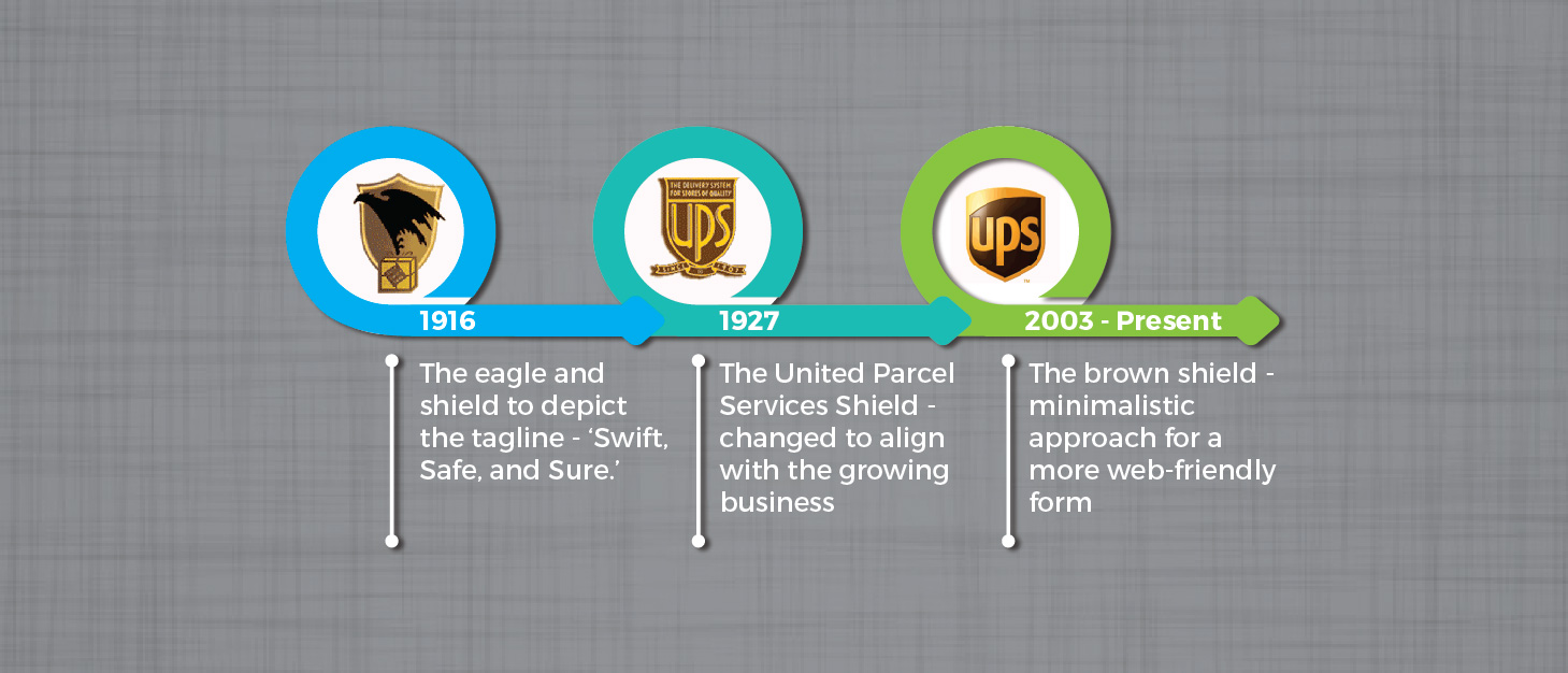
By 2003, the color brown had become very much a part of UPS’ identity and the brand capitalized on this with the slogan ‘What can brown do for you?’ Despite a simplistic design, UPS was able to create a lasting impact by increasing brand recall with its logo.
 Amazon ﹘ Telling your brand story
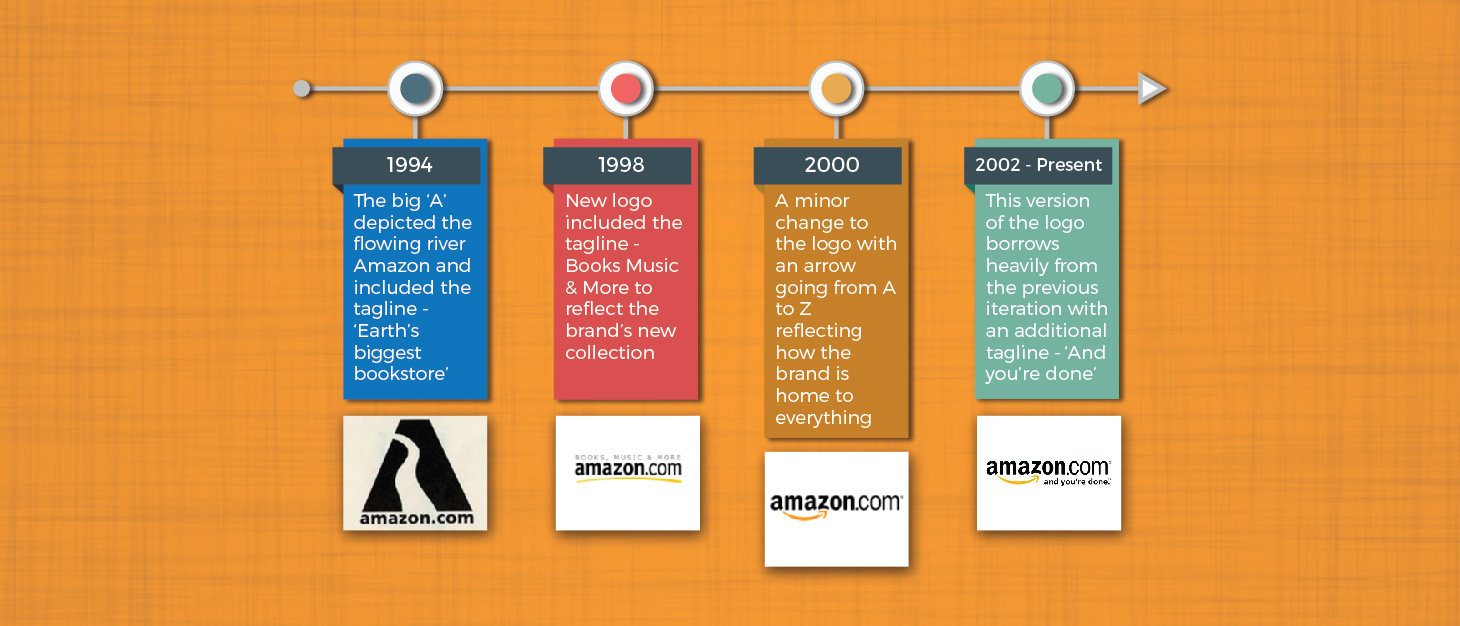
Founded in 1994, Amazon started its eCommerce journey as an online book store. Today, it has grown to be a multi-billion dollar brand that sells everything ﹘ from sporting equipment to home appliances. Their logo played an essential role in this success by telling the brand story to its consumers. Whether by making timely changes to the tagline or adding minimal graphic elements ﹘ Amazon made small changes that had a huge impact on the brand image.
 Shell ﹘ Sculpting an identity with design
Since the 1900s, this oil giant’s logo has undergone drastic changes, including a realistic rendering of a scallop shell, simplified form, and distinctive colors.
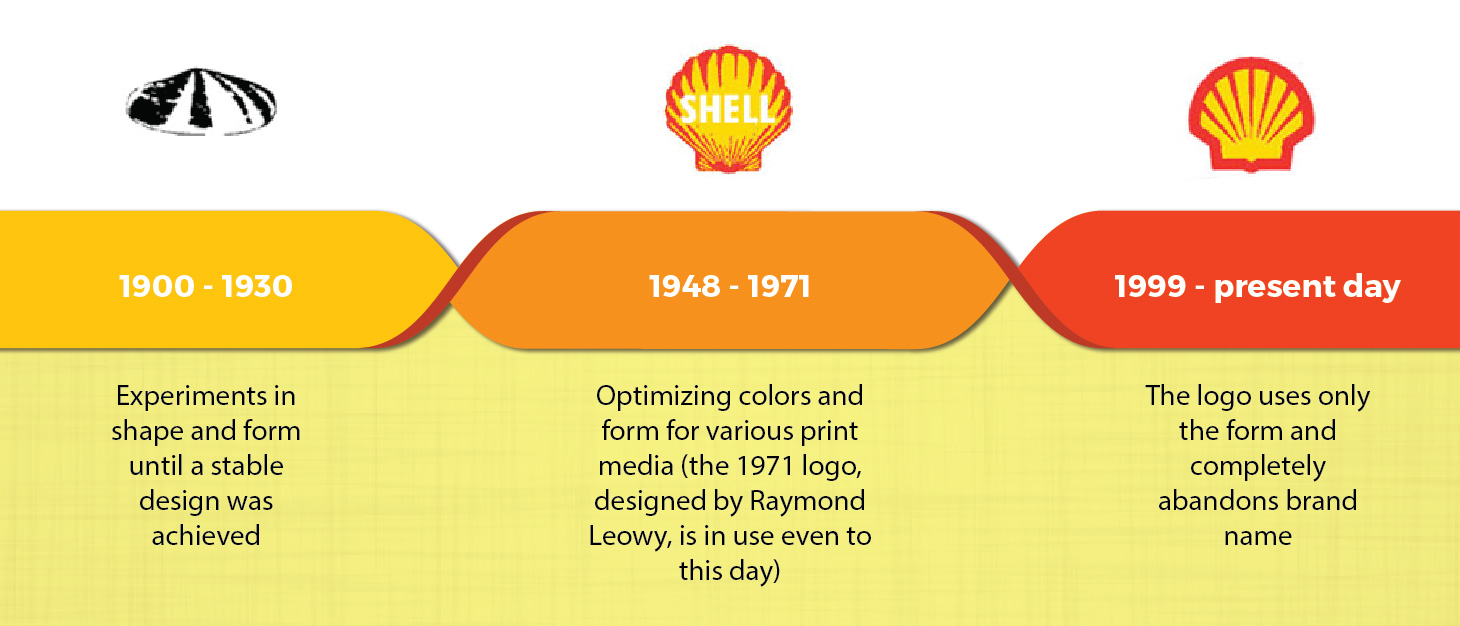
Shell’s logo has undergone many changes but the basic shape continues to remain the same since 1900s. As a result, Shell steadily improved its brand recall to a point where it no longer needs to use the brand name to support the logo.
 FedEx ﹘ Conveying the bigger picture
From a small parcel delivery service in 1971 to a global conglomerate, FedEx has come a long way. Their logo design and clever re-branding paved way for their success.
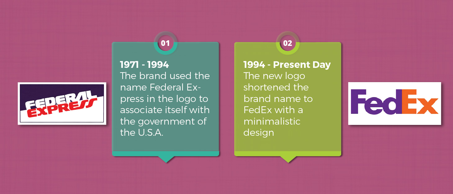
FedEx’s new logo, although simple in design, has a hidden symbol within it. A closer look at the logo will reveal an arrow between the letters E and X, symbolizing FedEx’s speed of delivery, making it a logo to remember.
 McDonald’s ﹘ Simplicity and symbolism
Founded as a drive-through fast food restaurant in 1940s, McDonalds has played every trick of the trade to dominate the world of fast food. And even the logo aligns perfectly with the brand’s vision.
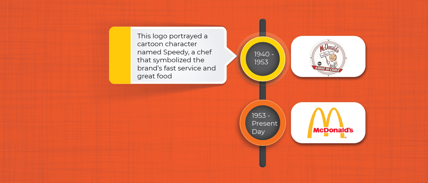
McDonald’s current logo originated from an element derived from the design of their first franchise where the architect had planned an M-shaped doorway.
McDonald’s M on a field of red has been analyzed and talked about at great length. Many experts believe the logo has several subliminal implications but the arches and their golden color was meant to attract new franchise owners, conveying the fact that owning a McDonald is nothing short of owning a gold mine.
 Adidas ﹘ Maintaining the basic form
Adidas’ roots can be traced back to an independent German sports company that simply placed three stripes on all their products. As the brand grew, they got themselves a logo and changed it a few times to better align it with the brand. But, it is the stripes that truly propelled the brand forward.
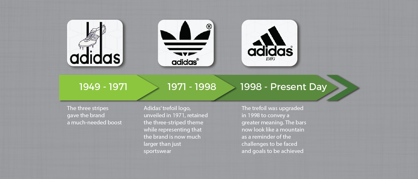
Adidas’ black stripes make for a very striking design and they can be easily placed on any product. That’s not all, every logo iteration from Adidas incorporates the stripes, ensuring that you remember the brand every time you’re out shopping for a new pair of sneakers.
In short, an ideal logo should
- Identify with your business
- Stand the test of time
- Be easily recognizable, memorable, and adaptable
But don’t stop there, take these qualities and make them a part of your business ﹘ from your website to your office space. In short, simplicity and consistency are the keys to building a powerful brand identity.
