Nike, McDonald’s, Apple – these brands might be completely different in their offerings, but they have one thing in common – brilliant logos. From the swoosh to the bitten apple, these logos are recognizable worldwide, helping the viewer associate with the brand instantly. But what makes such a logo? What makes a brand reel in fans with just a symbol? A great logo should convey the brand’s intended message and connect with the target audience, all without much effort. It’s no wonder then, that companies spend millions on developing one! Want to know more? Let’s dive right in.
What is a logo?
It is a symbol, graphic mark, or emblem adopted by an organization to help the target group identify its products or services. It sounds simple, but in reality coming up with an effective logo is an arduous process – starting from research to draft production. However, the effort is worthwhile, because good groundwork lays the foundation for a strong logo.
Why is it important?
Apart from being a visual representation of your brand, there are multiple reasons why you should invest time and money in a fantastic logo. Here are a few:
- Helps you stand out
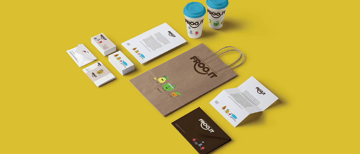
Your brand’s logo is present on your website, products, and business card. It is the first thing potential customers notice, and for many, the logo is the brand. It stands for the brand’s values, and can also be inspired by something the founder holds dear. In effect, to the outside world, your logo is the visual keystone of your brand and that’s exactly why you should invest in developing a good one.

- Brings in new customers
People are attracted to good design and color, and an effective logo successfully incorporates both. Say there are two big supermarkets on the same street, which one would you go to? Most likely, you will walk into the one with the most eye-catching logo. Hence, the logo adorning your business cards or storefronts should ideally create curiosity and interest in your product or service. Better yet, it should be good enough to convert that interest into sales.
- Creates a unique identity
There are certain symbols that have come to represent certain industries over time. For example, coffee shops and brands will generally have either coffee beans or a steaming cup of coffee as part of their logo. It certainly gets the message across, but doesn’t stand out among other coffee brands. This is where Starbucks got it right – its iconic Siren/Mermaid logo is unlike that of any other coffee shop, and is hence recognizable worldwide.
- Ensures brand consistency
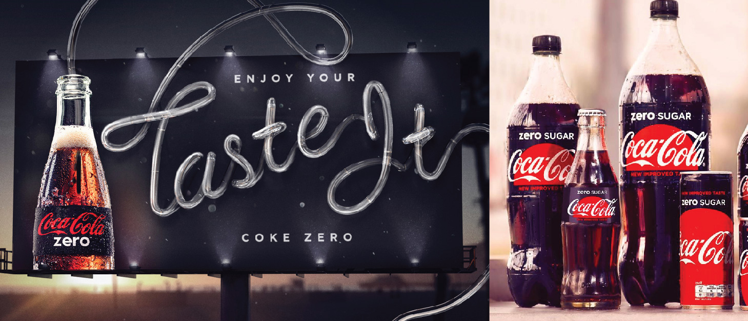
A brand’s logos appears on multiple platforms — billboards, automobiles, packaging, and social media, to name a few. If your logo appears inconsistently across these platforms, it can damage your recall value. Ensuring that your brand is represented correctly and clearly everywhere helps you maintain consistency and increase brand loyalty.
Simply put, a logo is a vital aspect of any brand and if you want your logo to instantly connect with your target audience, make sure it incorporates the following 5 features:
- Simplicity
A simple logo design is easily recognized, while being versatile and memorable. It must be unique, without being overdrawn or complicated. A refined and distilled identity is meant to catch the someone’s attention as they drive by, browse store shelves, or when they interact with any other form of brand promotion. Nail this aspect, and your brand’s logo could match the popularity of Apple, McDonald’s, or Nike!

- Memorability
A great logo must make a quick and lasting impression – this is especially difficult considering that consumers are bombarded with hundreds of logos every day. So, following from the previous principle, steer clear of overly stylized designs because simple logos are easier to remember. Once a person looks at the logo, he/she should be able to describe its basic elements effortlessly. McDonald’s is a great example of a memorable logo — ask anyone what it is, and they’ll tell you about the world-famous golden arches.

- Timelessness
An effective logo is modern as well as timeless. Steer clear of ‘trendy’ components in your design — trends come and go over time, and if you use them, you run the risk of your brand coming off as dated. Integrate contemporary features that will stand the test of time. One of the best examples of a timeless logo is Coca Cola. Compare it to Pepsi’s logo, and you’ll see that it has undergone only minor changes since 1885! That’s the mark of a timelessness — a logo whose essential elements remain constant, with small tweaks if needed.
- Versatility
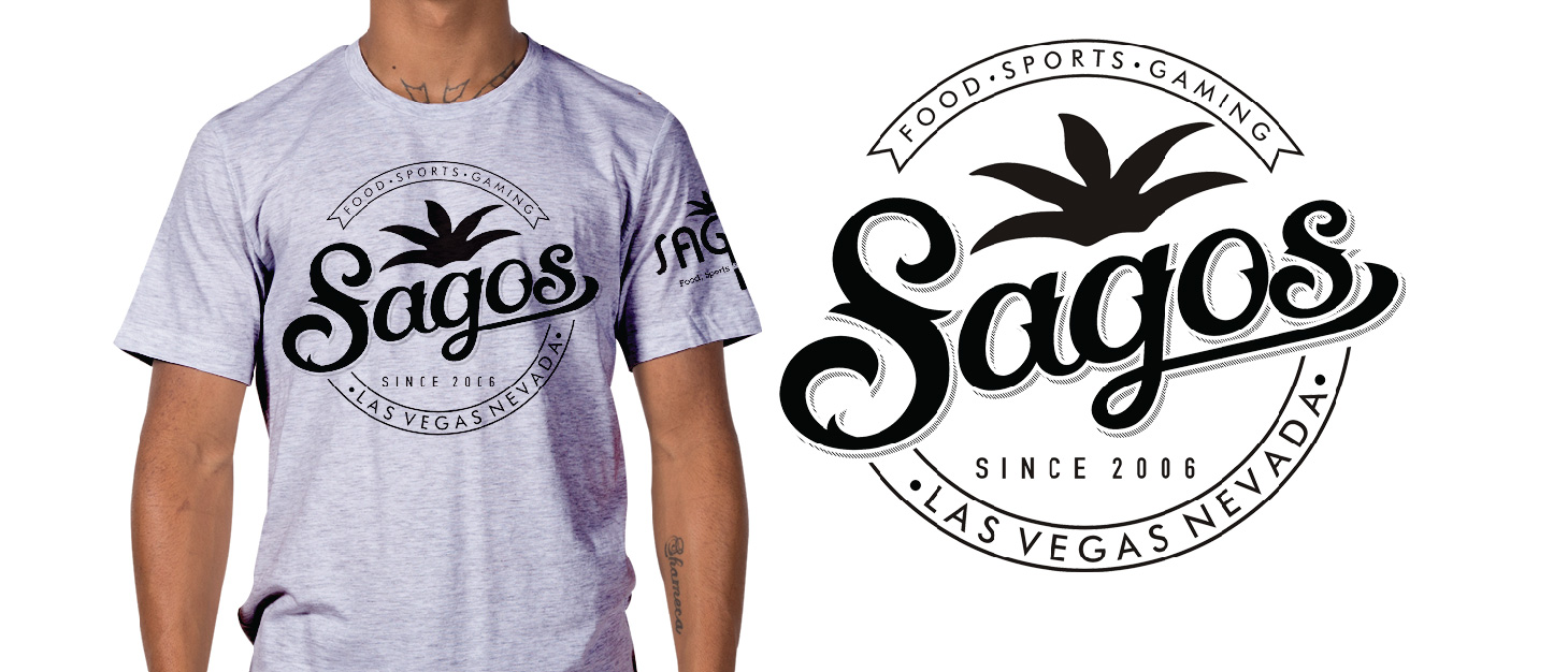
A good logo should be suitable for a variety of mediums (t-shirts, pens, billboards etc.) The logo should therefore be designed in vector format so it can be scaled to any size, as well as in horizontal and vertical formats. Logos might also be printed in a single color — so it’s a good idea to work initially in black and white. Apple’s logo is as versatile as they come — it’s adaptable to different platforms, colors, and sizes.
- Appropriateness
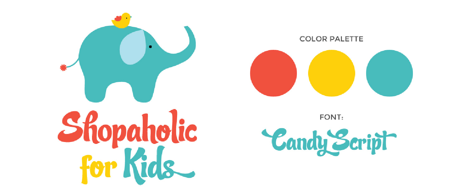
The positioning of the logo should be appropriate for its intended purpose. For example, if you are designing a logo for a brand of children’s toys, you should probably use a childlike, youthful font and color scheme. Also, a logo doesn’t need to show the brand’s product or service. For example, car logos don’t need to show cars, computer logos don’t necessarily need to show computers. The Harley Davidson logo isn’t a motorcycle, nor is the Nokia logo a mobile phone. A logo is purely for identification – it can be subtle, and still communicate what it intends to.
Your brand deserves recognition, be it in London, Paris, or Tokyo – so think about its ethos, the message you want it to send, and the services it has to offer. Then, jump right in and go for a timeless logo that expresses exactly that. We promise you, it’ll grab eyeballs, be it on a billboard or a brochure!
